Photon Transfer Curve
Prepared 2007-11-24 by Bill Claff
Revised 2007-11-30
Photon Transfer Curve
The Photon Transfer Curve (PTC) is a log‑log plot of
noise versus signal for a digital sensor.
The logarithms are base 10 and the noise and signal units are electrons.
This type of plot comes from an engineering tradition and is commonly used to
determine Dynamic Range (DR)
Here is a Photon Transfer Curve:
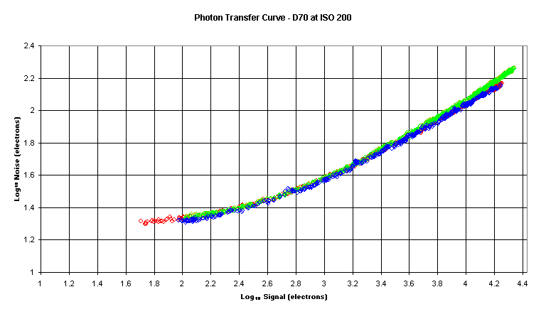
Note that during the collection of data, while signal is being
varied, exposure time is held constant.
In this plot the separate Color Filter Array (CFA) channels are color‑coded.
In this article the red (R), green (Gr and Gb), and blue (B) channels are
always color‑coded in this way.
Equations in charts also always appear in the R, Gr, Gb, B order.
Normally there would be a sharp drop off at the right‑hand side of the
plot but in this case I did not gather data to the point of CCD saturation.
In this case the noise floor is about 19 electrons and the Full Well Capacity
(FWC) is about 27,000 electrons for a DR of 63dB.
Signal to Noise Ratio (SNR) Profile
The Photon Transfer Curve is of little photographic interest and I prefer to show that same data as a Signal to Noise Ratio (SNR) versus signal plot.
Here is such a Signal to Noise Ratio curve:
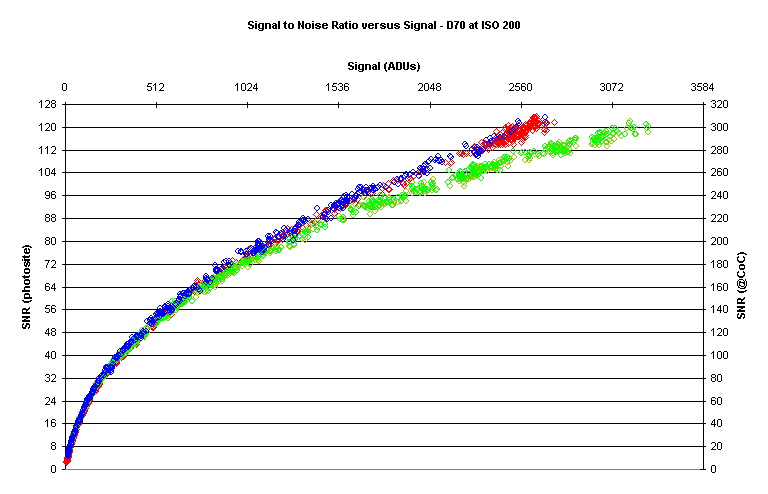
Note that the units are Analog to Digital Units (ADUs),
sometimes referred to elsewhere as DN.
The left‑hand scale shows the SNR for individual photosites.
The right‑hand scale is adjusted to “pixel bin” to the same area as the
Circle of Confusion (CoC) for this (DX or APS‑C sized) sensor.
Pixel‑binning, grouping adjacent pixels together, is key to determining Image Quality (IQ) and reflects the fact that we don’t have the visual acuity to see individual pixels under normal conditions.
Here is a closer look at the left‑hand side of the preceding curve:
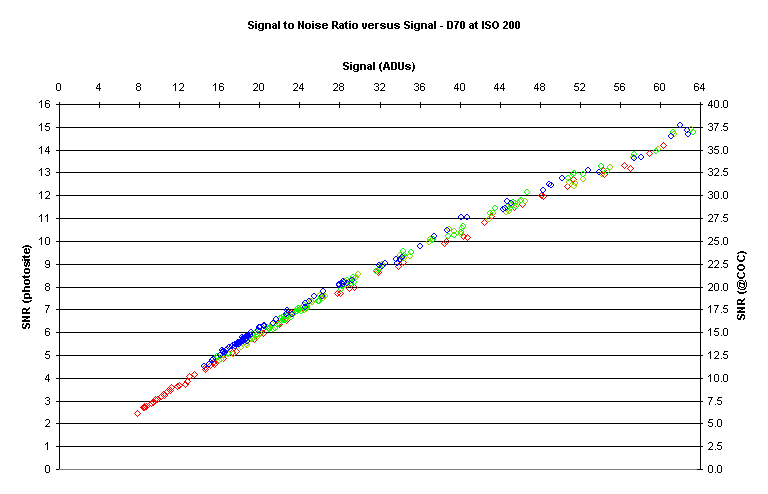
Note that the data is well behaved and relatively straight.
I have chosen an SNR value of 20 to
represent “good” image quality in line with ISO standards.
Now let’s take an even closer look at the area around an SNR value of 20:
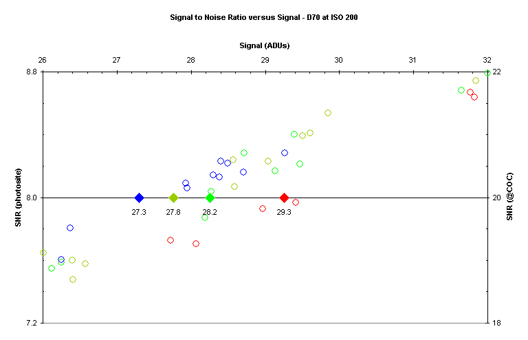
The diamond symbols represent the intersection of the SNR
curve with a value of 20 for each CFA color.
The values are 29.3 ADU, 27.8 ADU, 28.2 ADU, and 27.3 ADU for R, Gr, Gb, and B
respectively.
The above values correspond to dynamic ranges of 7.13 EV, 7.20 EV, 7.18 EV, and
7.19 EV; around 7.2 EV on average.
Computing Additional Values
By taking two exposures at each signal level, certain noise sources can be subtracted out; and some other additional values of interest can be computed.
Photo Response Non-Uniformity (PRNU)
The noise that is removed has two components, one fixed and
the other linear with signal strength.
The fixed noise is mostly dark noise.
The variable noise is due to the fact that the photosites, as a group, aren’t
perfectly linear; this is Photo Response Non-Uniformity (PRNU).
Here is a plot showing PNRU:
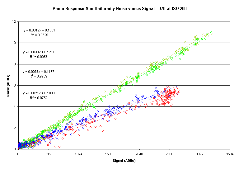
Note how straight the linear curve fits are.
PNRU is generally given in units of percent.
The red/blue PNRU is about 0.20% and the green PRNU is about 0.33%.
The offsets are positive, as expected.
The precision of the offsets is unclear but they may be of some value in
analyzing dark frames when dark frame subtraction is not appropriate.
Read Noise
With PRNU and other fixed noise
removed, the resulting data comprises a fixed amount of noise plus photon noise
(a type of shot noise).
To estimate the fixed noise we extend the noise versus signal curve to a signal
value of 0.
For example:
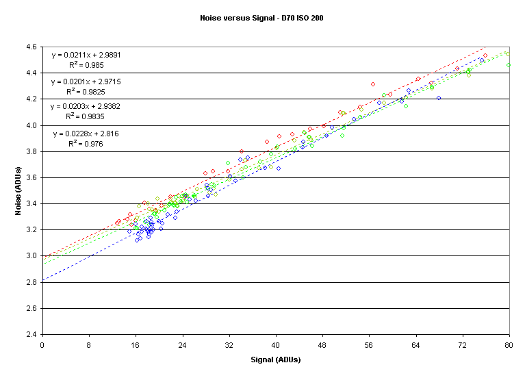
The values are 3.0 ADU, 3.0 ADU, 2.9 ADU, and 2.8 ADU for R, Gr, Gb, and B respectively.
Caveat
I get lower Read Noise (RN) values using a different technique
involving the analysis of dark frames.
The reason is that the read noise has a positive bias; that is, it is not
centered at zero.
Gain
As stated earlier, after image
subtraction the dominant source of remaining noise is photon noise.
Photon noise is proportional to the square root of signal; so variance, the
square of noise, versus signal should be a straight line.
Here is a plot of variance versus signal:
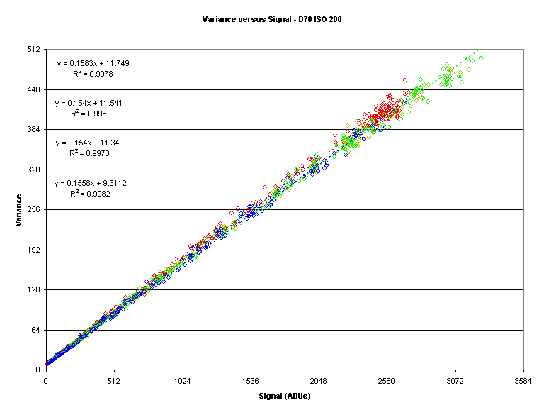
Note how straight the linear fits appear to be.
However, appearances can be deceiving.
There is a slight bend in the previous plot which becomes apparent when we examine the plot of the Signal to Variance Ratio (SVR) versus signal:
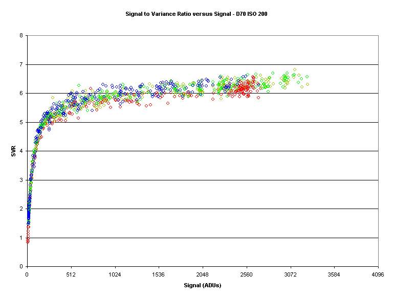
Now, as expected, we can see that photon noise doesn’t dominate until the signal reaches a certain level.
Now lets’ reexamine the variance to
signal plot and refine the region of interest.
Based on what we observed in the SVR versus signal plot I have restricted the
plot to signal values of 768 ADU or higher:
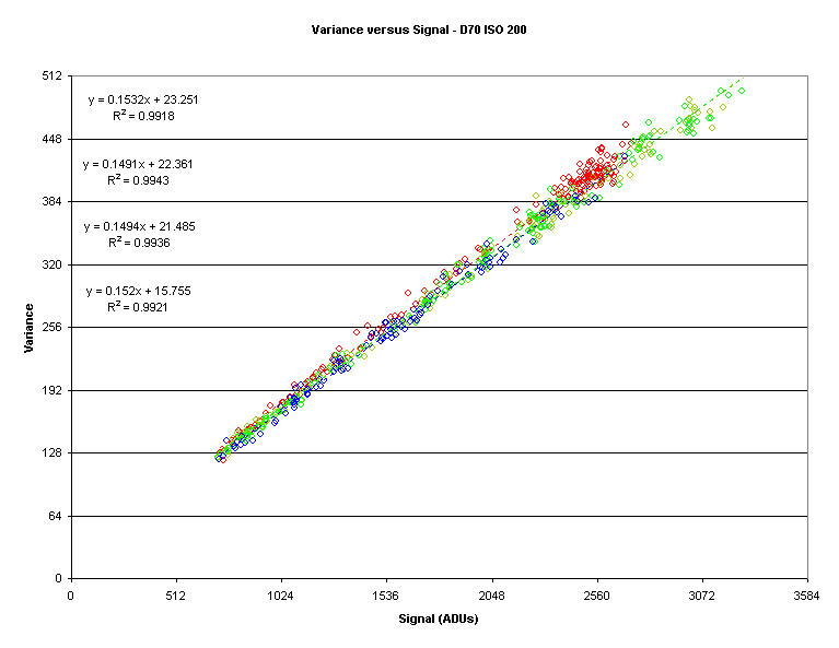
The gain, in electrons (e-) per ADU, is the
reciprocal of the slope.
So the gains are 6.5 e-/ADU, 6.7 e-/ADU, 6.7 e-/ADU,
and 6.5 e-/ADU for R, Gr, Gb, and B respectively.
These values look reasonable comparing to the right‑hand side of the SVR
versus signal plot.
Knowing the gain allows us to convert ADUs to electrons for
reporting purposes.
It also allows us to compute the Full Well Capacity (FWC), or a least a lower
bound; in this case the FWC is 27,000 electrons using the average gain of 6.6 e-/ADU.
Conclusion
It’s clear that a wealth of information can be garnered from the data required to construct the Photon Transfer Curve.